Estimated reading time: 3 min
One of the most striking ways an architect can bring a unique identity to a design is through the use of colour. Colour can tie a design into local culture or pay homage to a certain artist or architects. It can help people work out how to relate to a project through emotional coding and it can even contribute to the purpose of a project through neuropsychological reactions to certain colours.
The science around neuropsychological stimulation through colour can help architects choose appropriate colours to encourage certain behaviours in certain spaces. Yellow, for example, encourages intellectual stimulation and is therefore ideal in the workplace. The colour blue has a calming effect on observers, which is why you might often find it in high-stress environments such as hospitals. In retail, using colour across the ceiling and rear wall draws the eye of the observer into the depth of the space and encourages them inside, which means more potential purchases.
We could spend an entire article looking at what colours to choose and why colour should be included in architectural designs. For this article however, we will focus on how to integrate colour into a design using some of RMJM’s most colourful and exciting projects.
Colourful Materials
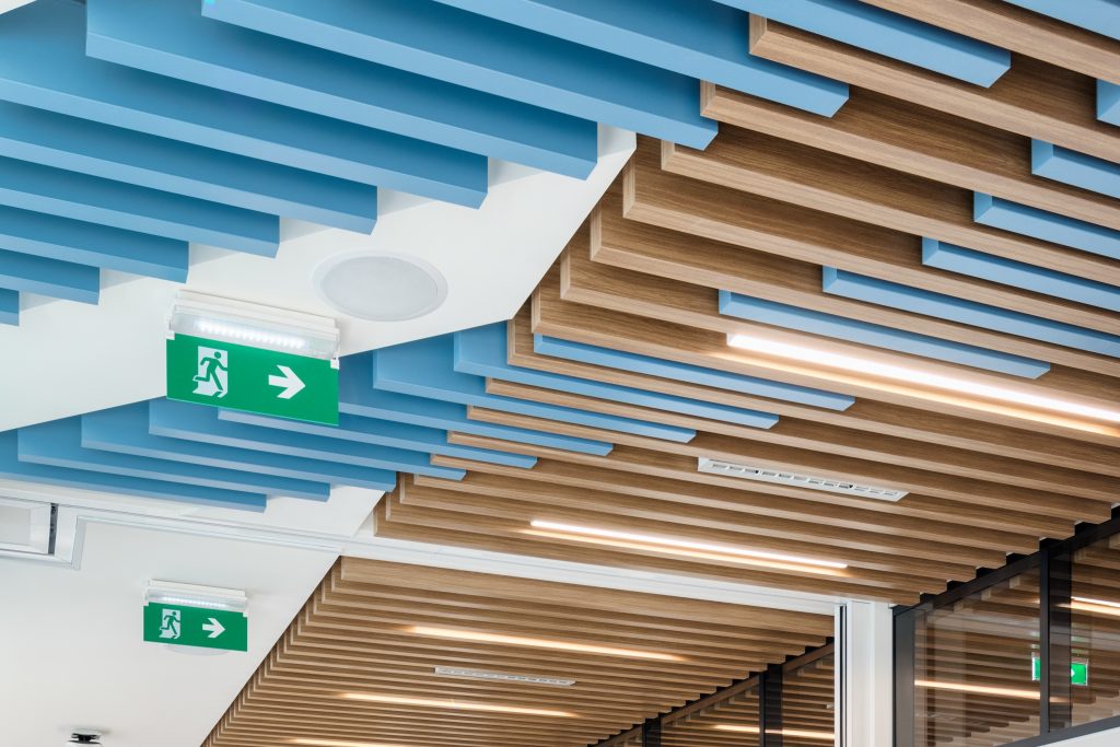
One way to infuse colour throughout a design is through the choice of materials. In their brief for Tech Office Level 07, RMJM Serbia were required to pay homage to the city in which the office was situated. One of the ways they achieved this was to use wood with a blue veneer to wind its way across the ceiling throughout the level to represent the convergence of the two rivers of Belgrade; the Danube and Sava.
Interior Design
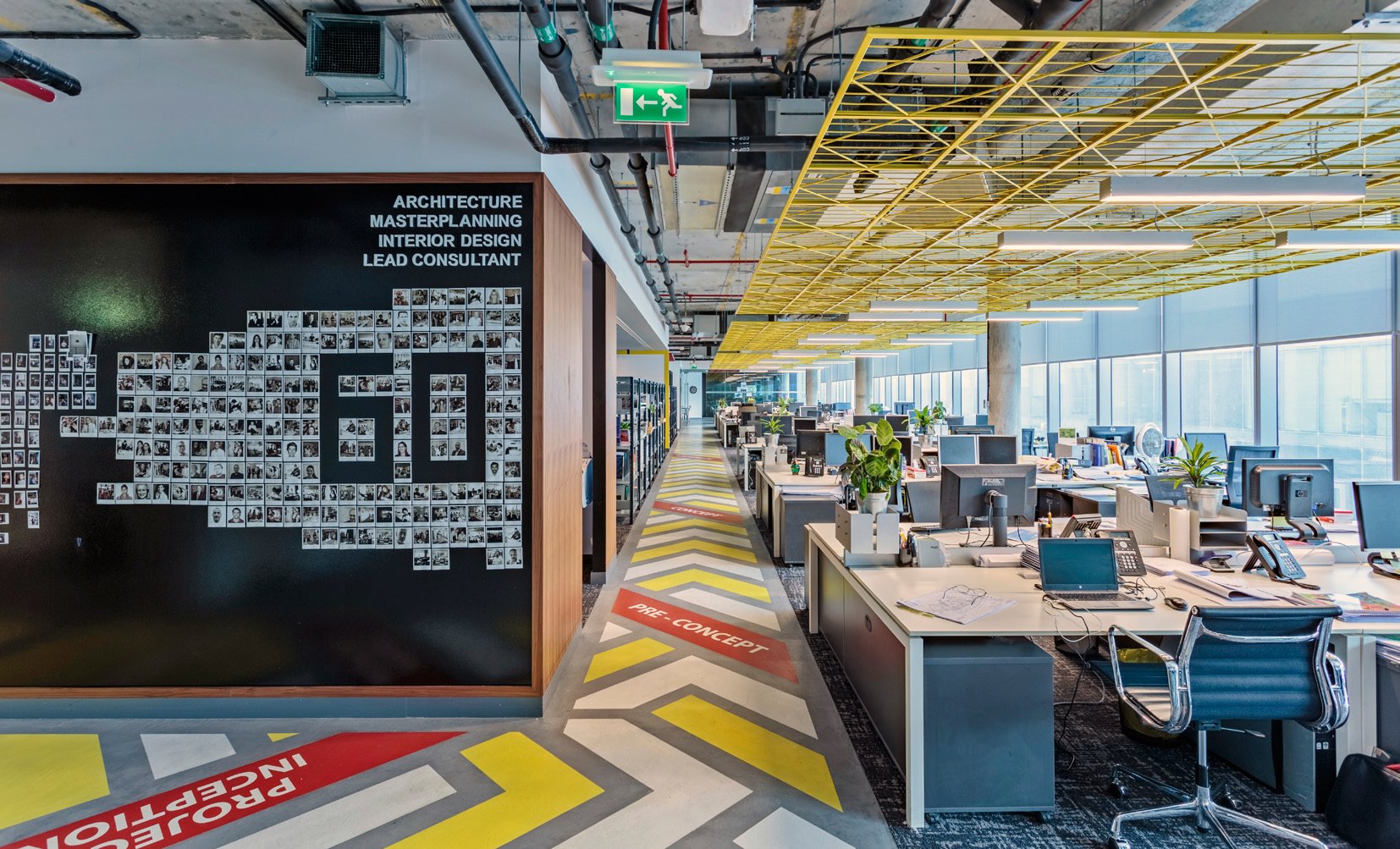
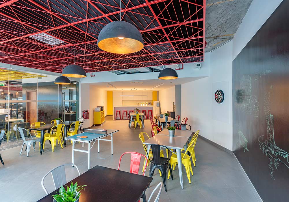
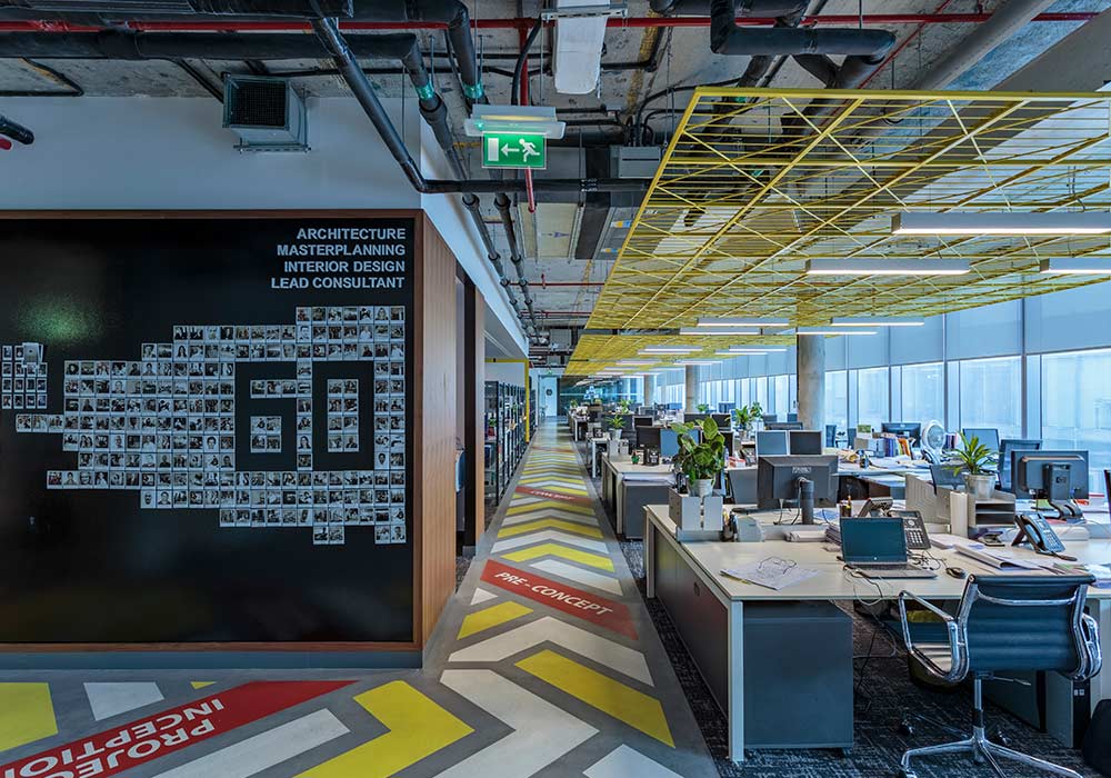
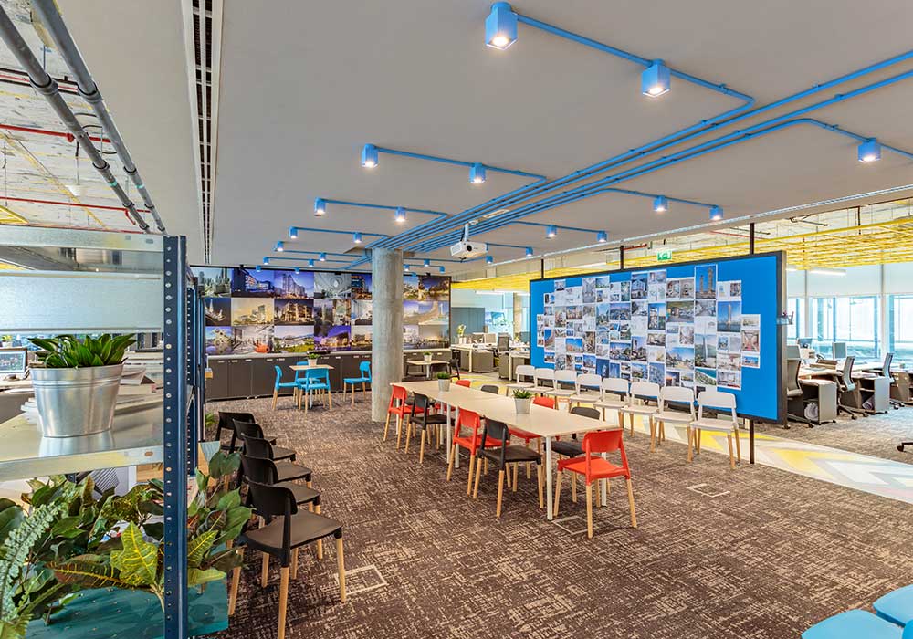
The interior design of RMJM Dubai’s offices is exemplary of how colour can be used throughout the interior design. Colourful chairs and sideboards, painted walls, decorative floors and ceilings, visible pipework and potted plants on empty surfaces make the office appear full of life and creativity, even when there isn’t anyone present in the building. Using the three primary colours for their colour story allowed for the narrative to move throughout the space without areas feeling disconnected or out of place.
Artwork
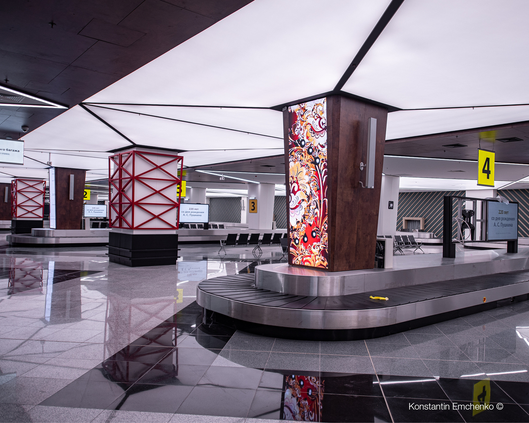
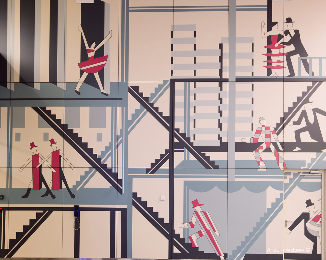
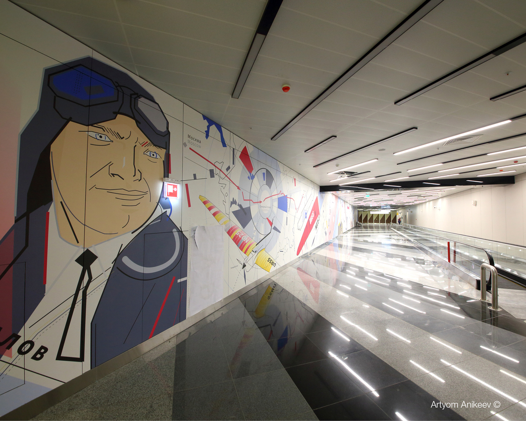
Perhaps the easiest way to include colour in a design is by inviting local artists to collaborate on the design. RMJM Serbia embraced this idea when designing Sheremetyevo Terminal C. Inspired by Russian Avant-garde and constructivist ideas, artistic installations are visible throughout the airport.
Digital Media Integration
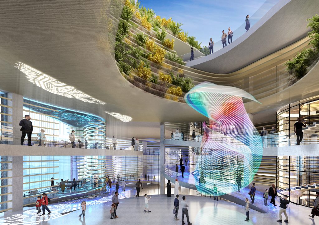
Having been around for over 60 years, RMJM has been able to witness some of the most exciting changes in the architecture industry. Digital media has completely changed how architects operate, thanks to technologies such as BIM. Now architects are taking things a step further and integrating digital media into their designs to elevate their use of colour and find new ways for users to engage with a project. One fantastic example of this is RMJM Dubai’s concept design for the KSA Pavilion.
Lighting
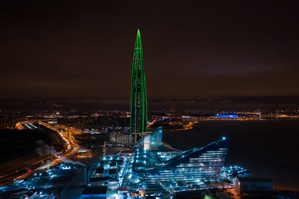
The Lakhta Centre is an incredible building in many ways, from its record-breaking height to its state-of-the-art glass facade. However, it is difficult to overlook one of the most fascinating aspects of this building’s design: lighting. Whereas other forms of introducing colour require an architect to pick a colour scheme and stick with it, the lighting design for the Lakhta Centre allows the building to choose new lighting schemes reflecting specific seasons, events and emotions. Unlike other projects mentioned above, this feature also embraces the use of colour not only within a building but also across its exterior. This allows it to elicit emotional responses not only from building-users but from any observers within the city. Working with RMJM, Lichtvision was able to use light to colour the building across all 462m.